Designing a logo has always remained one of the most undervalued aspect of graphic designs, particularly in Eastern Nigeria. Now, maybe it’s the same everywhere, but I can only speak about where I’m based and have spent all my life in. As a graphic designer, I’ve frequently had customers who’d made it look like I’m trying to steal their money when I charge them for logos. Trust me, it can be frustrating at times. You’ll hear things like; “so because of this small thing, that’s why you want me to throw away that kind of money” or “Please, I don’t have that kind of money to dash out”. They make logos seem like one of the less important part of business startup; and yet, these are the same people that would want heaven on earth on the said logo; the same people that would tell you about how they love good jobs; the same people that would be so quick to criticize your work and order you to start afresh.

In this post, I’ll be trying as much as possible to explain the concept of logo designs in an attempt to enlighten people on its complexities. The truth is that most people, yep, maybe including you reading this post, don’t know how logos help in packaging a brand’s identity. It’s what you expect people to see and mentally register your brand with.
When I first began my brand as a graphic designer, I fell victim frequently to undercharged logo design jobs. That was because I didn’t carry out enough research as to what logo designs entailed. I designed a lot of logos for little to no charge at all. In my defense though, I was just starting but I later understood that I was undervaluing myself and my skill. That’s why I told one of my students last year that despite the fact he’s just getting into the graphic design business, it’s no reason to do any job, particularly logos, free of charge.
According to investopedia.com, a logo is a graphic mark, emblem, symbol, or stylized name used to identify a company, organization, product, or brand. Simple, right? It further explained that a widely and instantly recognized logo is a valuable intangible asset for a corporation and is thus trademarked for intellectual property protection in the majority of situations.
Internationally, companies pay a great deal of money to ensure that they have an aptly original logo that identifies them in the midst of the commercial crowd because they know that logos go a long way in enforcing their presence in the midst of competitions.
In my bid to further enhance my knowledge of logo designs, I had to research a list of top companies and their logos and I was marveled as to the level of creativity put into these logos.
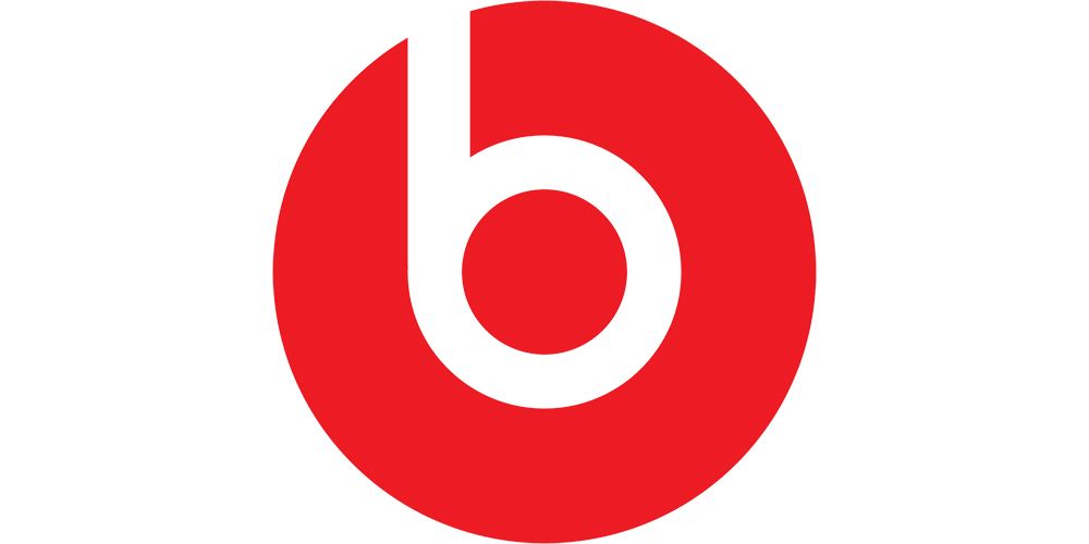
Did you know that the circle in the logo for “Beats by Dre”, isn’t just a circle. It actually represents a human’s head, and the ‘b’ letterform represents the brand’s headphones. This gives the brand a personal element, allowing a customer to see themselves in the headphones.
Cisco, the worldwide leader in networking for the internet, is named after its headquarters’ location in San Francisco. While its namesake doesn’t have a hidden meaning, the blue stripes above the logotype not only represent an electromagnet but also, the Golden Gate Bridge.
The American broad casting company, NBC’s logo has a couple of hidden meanings. It’s clear that it’s a peacock, but why? When the logo was developed color televisions were being introduced (explaining the rainbow of colors), and the network wanted a logo that would cause black and white TV owners to make the switch. So, they went with the common phrase (at the time), ‘proud as a peacock’, promoting that they were proud of their new color system. The six different colors of the feathers represent the six different divisions of NBC.
Amazon’s logo reflects that it’s a powerhouse when it comes to online shopping. The yellow arrow in their logo starts at the letter ‘a’ and ends at the letter ‘z’, implying that they sell everything from a to z. The arrow also represents a smile, with the arrowhead being a stylized dimple or smile line. The smile indicates the happiness people feel when they shop with Amazon.

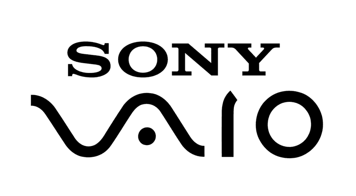
Sony VAIO, aka Visual Audio Intelligent Organizer, is known worldwide for its technology. VAIO represents the integration of both analog and digital technologies in its products. The letters ‘va’ are made to look like an analog wave, while the ‘io’ resemble the numbers 1 and 0, representing a digital signal or binary code.
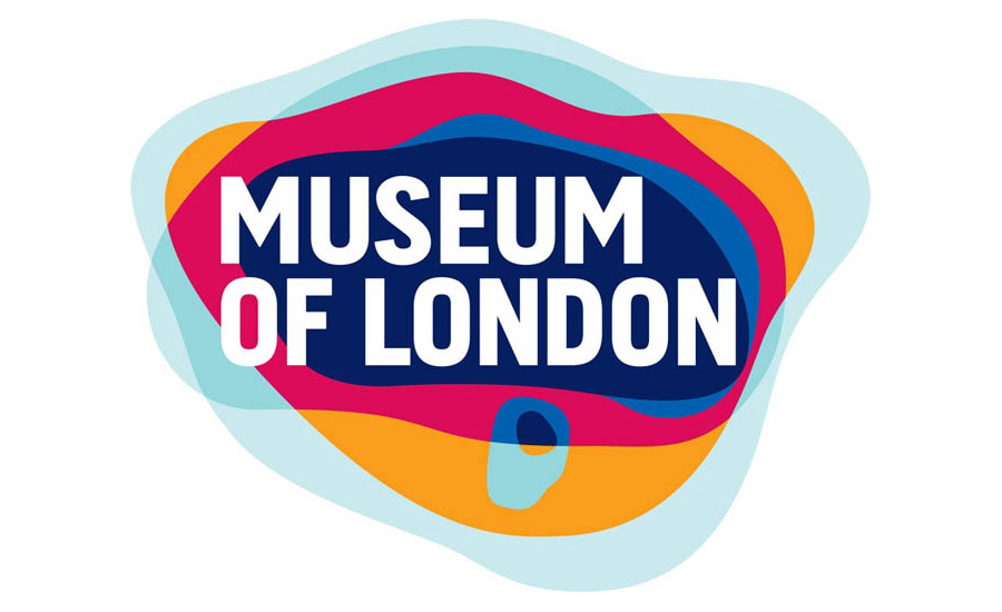
The Museum of London has an interesting, organic look. The shapes of color actually represent something, though, and aren’t just abstracted blobs of color. They show the geography of London and how it has changed over time, representing the constant change of London and its people in the past, the present, and looking towards the future.
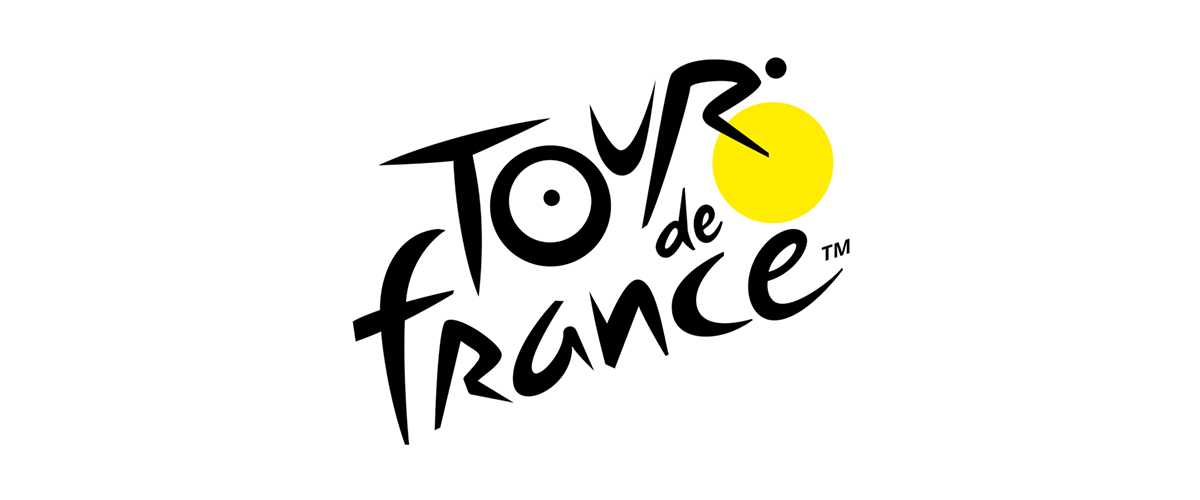
Le Tour De France logo has two hidden messages inside of it. The first is a bit more obvious, with a cyclist making up the letter ‘r’, but the second is more subdued. The yellow circle that acts as the bike’s wheel is also a sun, indicating that the events of the race only occur in the daytime.
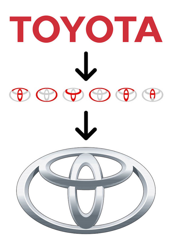
Toyota’s logo includes every alphabet of the company name within its three overlapping ellipses. The ellipses also symbolize the unification of the hearts of Toyota customers and Toyota’s products. The background space represents their technological advancement and the opportunities that lay ahead
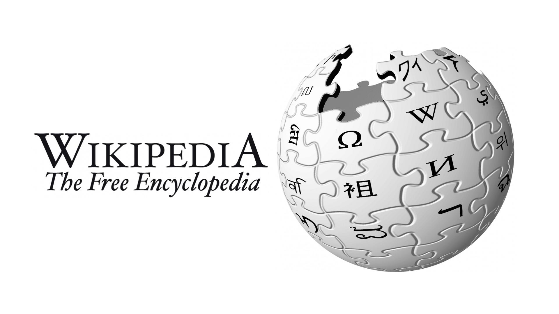
There’s not so much a hidden meaning in Wikipedia’s logo, but have you ever wondered why the spherical jigsaw that is the Wikipedia logo has parts missing? It’s pretty simple, Wikipedia’s goal is to be an encyclopedia of knowledge for everybody, everywhere. Having the sphere being incomplete represents the fact it will always be a work in progress, increasing in articles and information every day.
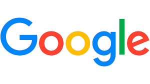
Another incredibly recognizable logo worldwide (even after their recent redesign), Google’s logo is supposed to symbolize that they don’t play by the rules and know how to have fun. Instead of having a crazy font or symbol, they chose to relay their message with color. They stuck with the primary color palette but broke it with a secondary color, green.
The 3rd most expensive logo in the world as at 2019, belongs to Accenture and was done for One Hundred Million Dollars ($100,000,000). Looking at this logo, you’d think it was a waste of money because of how simple it is, but if you read deeper into its symbolism, you’d see how it’s almost (Yeah, I said “almost” because to me, it failed woefully in beauty for that amount of money) worth it.’
I realized that most of these logos might not readily give you that impression of beauty until understood. Some are actually very simple, like strikingly simple but when I found out what they were meant to say, I was marveled. It got me to extensively understand that logos should go beyond beauty and lay understanding, it should be a solid representation to the values and lifestyle of the company in question.
It further re-enforced my belief as to why logo designs seem to cost more than other forms of graphic designs in the higher corporate world. For a logo designer, it’s usually a very big challenge to round up variety of ideas, beliefs, values, aims, objectives, you name it, into one tiny object or illustration that represents the brand. Some designers spend hours, days or even weeks in other to come up with that unique logo that figuratively spells out the brand.
After understanding how complex its concept is, I decided to take a short break from offering logo design services. I wanted to build up myself more on how best to carry out the service. I understood that there are questions to be asked; information asides the name of the company, client’s color choice and motto of the company, to be gotten before commencement of a logo design job. Now, I can’t say that I’m excellent, but I know I’m better.
The issue however, is that most people don’t understand some of these things, and no matter how much you tell them, they’d choose to remain in their ignorance. A client who is into baking would not want to hear that it’s not a necessity to include different baking equipment in the brand logo. A client who needs a logo for his/her bookshop wouldn’t want to hear that it’s not a necessity to include a house on top of a stack of books as its logo. A client who is into fashion designs or tailoring would not want to understand that it’s not a necessity to include a needle and thread or a sewing machine or a dress silhouette in the brand’s logo. And don’t get me started on the client who’s into computer repairs that wouldn’t want to hear that having a phone or a laptop in his/her brand’s logo is not necessity to the logo’s authenticity. To clients like that, I painfully decline to offer them my service. I strongly believe that not all persons who come to me for a job should be my clients.
In as much as I understand it’s the client’s decision that should matter, I believe that most times, these clients need a professional opinion about what they want. If I need a customized car, because I don’t know squats about making a car, I can’t go to a car manufacturer and tell him or her that the car I need should have its back in form of a combination of peacock tail and a fish tail; then the front should have an angel’s wings, largely on its side and the side should be made of spinning doors etc. Note that though It might be possible to make, it might not as effective. And when asked what I need the car to portray, and I say elegance and class, it’s their job to tell me how deranged I sounded when describing how the car should be. This is because, they are the professionals, it’s what they do. Drawing comparison to myself as a logo designer, I have a duty to give you an idea of what your logo should be. But if you insist, it must be the way you want it, I can decide I wouldn’t take the job.
In summary, logo designing involves a lot of process; the planning, the manipulation, the composition, they are just much. So, if a designer tells you an amount he or she charges, check their work out first if you are not that convinced they’re worth it. Make sure they have a strong online presence with a display of former jobs so as to know their capability. For designers out there, don’t stop trying to improve your skill. And while charging customers, remember to “fear God small”.
Hey Victor, thanks a lot for taking out time to read my article, means a great deal that you learned a lot from it.
However, I’d like to address some of the points you raised.
Firstly, to answer your question where you asked “Using the illustration of going to a car manufacturer with the intent of making a custom made car, shouldn’t I be the one to communicate to the manufacturer those emotions and aspiration which nudged me to get a custom made car? How is that a problem?”. Well, I remember I clearly insinuated that before the commencement of any logo design services, there are questions one’s supposed to ask the client to get a better picture of the job required. It’s those questions that guides the designer in creating the perfect logo for the client. In as much as you already have in mind what you want for your logo, you should be willing to accept that SOMETIMES, the picture in your mind might not be the perfect picture meant for the survival of your company’s image. As a graphic personnel, my job is then to try and explain it to you as to why what you want may not be what is needed.
Now don’t get me wrong, the logo designer is supposed to advise you on what is needed for your logo after hearing about the company’s vision, aim, emotions, values and so on; to advise. For me, if after advising you, and you still maintain your decision, if I feel I can’t meet your desire, then I let you go, it doesn’t matter how much.
Mind you though, you’re paying me doesn’t mean I can’t try and explain things to you as the professional in this context. It’s just like going to the hospital, paying your hospital bills and telling the doctor to prescribe the medicines on your list without even checking you up and determining if you really need those drugs; or as a patient, instructing the doctor and medical personnel before going into the surgery room for an operation on what how you should be operated on. I bet you that most of these companies with expensive logos, didn’t have that idea in mind before the finished work and paying for them.
Thanks once again for the feedback, I hope you read my future articles.