A dab of colour can add great impact and dramatic appeal to a graphic design. Any image will stand out or look dull with the designer’s choice of colours. After all, colours evoke emotions, meanings and thoughts in certain ways. By understanding the role of colours and the colour theory, the designer can then apply that understanding to produce an effective graphic design.
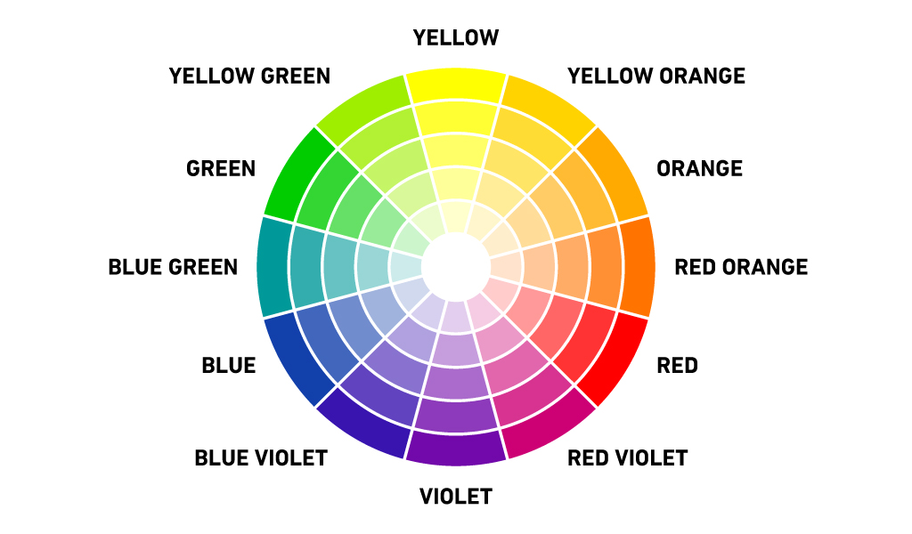
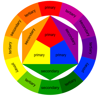
The graphic design element, colour, has properties, namely hue, saturation and value. Hue, another term for colour, is divided into three: primary, secondary and tertiary and are shown in a standard colour wheel diagram. Mixing colours will allow you to come up with limitless types of hues. Saturation is the intensity of a certain colour determined by the amount of white (lighter) or black hue (darker) added to it. Now the lightness or darkness of a specific colour refers to its value. Tints are colours with more white and shades are colours with more black.
Anyone who is into graphic design needs to understand the two colour models, RGB and CMYK, which are used to measure and describe colour. The RGB colour model is based on the principle that all visible colours can be created from mixing and combining the primary colours or primary additives, red, green and blue. Meanwhile, the CMYK colours or the subtractive primaries are produced when two RGB colours are combined equally. C stands for cyan (green plus blue), M for magenta (red plus blue), Y for yellow (red plus green) and K for black.
Knowing the colour models is important to graphic design. Designs are generally viewed in RGB on monitors and screens but they will be eventually printed in CMYK. In the process, digital files in RGB will have to be converted into CMYK before printing.
Digital graphic design has of course a way to resolve differences between the colour viewed on screen and on print. This is where colour swatches come in. A third version of the colour must be selected to come up with the desired result. Often, the Pantone Matching System or PMS is used to do this. Colour swatches are assigned reference numbers which are identified and read by the printer.
At any rate, it is best that the graphic design professional knows how the client intends to use the design to come up with the best possible result. If the design will be used solely in digital format, as in the case of website content, then there is no need to separate colours by virtue of the CMYK model. However, the designer must make sure that, should the design be replicated in printed format, the colours in the original design can readily be separated for printing.
N.B: This article is not an original by any of the Dav-Oz blog team members. It was culled from a post made on 14 December, 2010 at fleek.marketing.